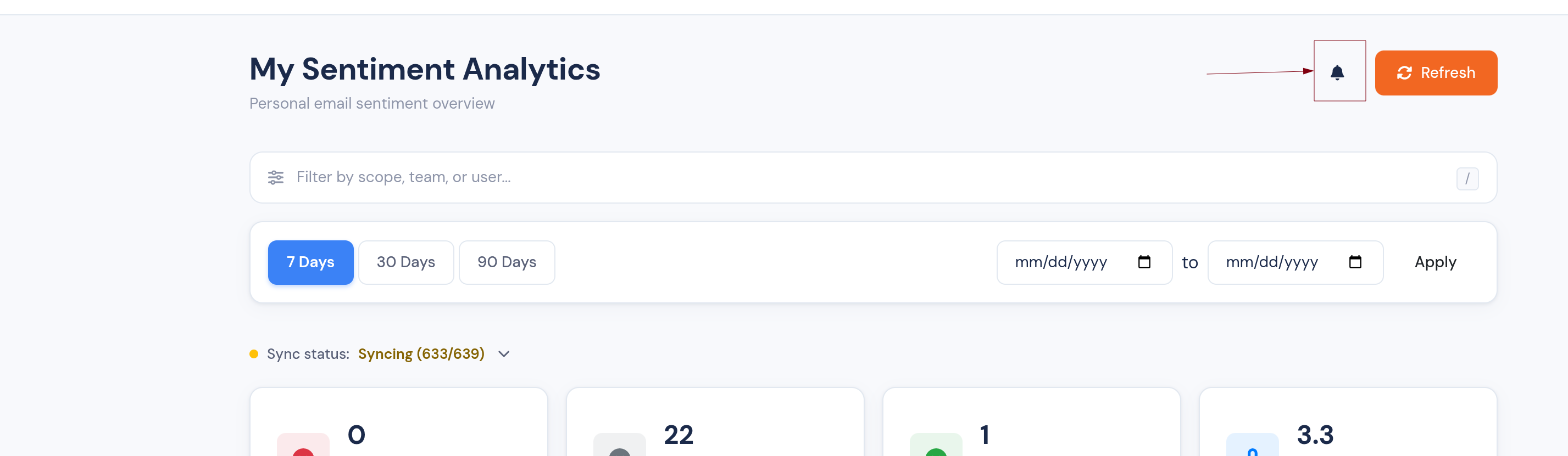
A more explorable Sentiment Analytics dashboard
The Sentiment Analytics dashboard is now organised into tabs, every number drills into the emails behind it, and you can jump straight to the original message.
We've given the Sentiment Analytics dashboard a big usability refresh. It's now faster to read, and every headline number is a starting point for investigation rather than a dead end.
Everything on one screen
The dashboard is now organised into tabs, so the summary cards, heatmap, and email lists each have their own space — no more endless scrolling to find the view you want.
Click any number to see the emails behind it
The dashboard used to tell you what was happening; now it shows you which emails:
- Sentiment cards (positive / neutral / negative counts) are clickable and open the exact emails that make up each figure.
- Priority × Sentiment heatmap — click any cell to drill straight into the emails in that priority-and-sentiment bucket.
Jump straight to the original email
Wherever you're looking at a list of emails — the negative-email drilldown or the per-domain breakdown — each row now includes a link that opens the original message in your mailbox, so you can act on it in one click.
Keep track of what you've reviewed
- Tick off negative emails as you work through them with a new "reviewed" checkbox; reviewed rows are visually de-emphasised so it's clear what's left.
- The Negative Emails summary card now headlines the negatives still awaiting review, with the overall total shown underneath for context — so the number actually moves as you clear your queue.
A clearer Average Temperature card
The Average Temperature card now carries an info tooltip and a plain-language band label (e.g. warm, cool), so the score is easy to interpret at a glance. Portuguese (BR) labels across the heatmap and temperature card have been tidied up too.
Open Sentiment Analytics to try it out.